
Interior Color Psychology 2026: Best Calming Wall Colors
Updated: Jul 31
Interior color psychology studies how color directly affects your nervous system - not just how a room looks, but how it makes you feel. The most calming wall colors for 2026 are warm greige (#C4B5A5–#B8A898) and soft sage green (#8FAF8A) - both measurably lower cortisol, while stark white raises visual stimulation and warm neutrals reduce it. The core formula is the 60-30-10 rule: 60% warm neutral base, 30% natural material tones, 10% one accent color. One rule changes everything: always test paint at 2700K bulb temperature - the same color looks completely different under cool daylight bulbs.
I used to think I was just a tired person, never realizing how much Interior Color Psychology was actually at play. Every evening, by 7pm, I was done flat, heavy, ready for the day to be over. I blamed my job, my schedule, the city. It took me two years to notice that the exhaustion started the moment I walked through my own front door.
My flat was painted stark white. Every wall. The kind of white that bounces light back at you like a challenge. The kind of white that says this is a workspace, not a home. I had not chosen it intentionally it was just there when I moved in, and I had never questioned it.
Then I repainted. Warm greige, floor to ceiling. Nothing else changed same furniture, same lighting, same life.
Within a week I stopped dreading coming home. Within two weeks I was spending evenings in my living room by choice rather than collapsing into it by necessity. The exhaustion I had attributed to everything else had been, at least in part, the color of my walls.
That is the psychology of interior design. Your home is not neutral. Every color on every surface is either spending or restoring your nervous system's energy every hour you are in it. This guide is everything I have learned about how to make your home work for you. To bring these calming colors into a room, the fastest route is natural materials and warm-toned furniture - see my guide to the best places to buy living room furniture for pieces that match this palette.

The Science: How Interior Color Psychology Affects Your Brain
That is interior color psychology in practice. Color is not aesthetic it is physiological. The colors in your home directly affect cortisol levels, heart rate, and nervous system state.
Key Research Facts:
Red - raises heart rate and cortisol, measurable within minutes of exposure.
Blue and green - lower cortisol and slow heart rate, the nervous system reads these as "safe environment" (Elliot & Maier, Color Psychology, Annual Review of Psychology, 2014)
Warm neutrals - warm neutrals such as greige and warm white reduce cognitive load because the brain processes less visual information, which registers as calm.
High contrast - stark white walls paired with dark furniture increases visual stimulation, which is the opposite of rest.
Matte finishes - absorb light and reduce visual noise. Glossy finishes increase it. This scientific approach to reducing overstimulation is why Warm Minimalism has become so influential in 2026, as it prioritizes a restorative environment over simple aesthetic reduction.
The psychology of interior design in one sentence: your home's color palette is either spending or restoring your nervous system's energy, every hour you are in it.
Understanding how intentional color choices interact with small space psychology is especially important in compact living where the walls are closer and the color impact is stronger. Read: Small Apartment Decorating Ideas 2026

Color Psychology Master Reference
Color Family | Psychological Effect | Cortisol Impact | Best Room | Worst Room |
Soft Blue | Calm, trust, mental clarity | ↓ Lowers | Bedroom, bathroom | Kitchen, gym |
Sage Green | Grounding, nature connection, restoration | ↓ Lowers | Living room, bedroom | Home office |
Warm White | Spacious, clean, low cognitive load | Neutral | Any room | N/A |
Greige | Stability, warmth, breathing room | ↓ Lowers | Living room, bedroom, hallway | Rooms needing energy |
Terracotta | Grounding, warmth, earthy security | Neutral–slight ↑ | Living room, dining room | Bedroom |
Ochre / Mustard | Energy, optimism, warmth | Slight ↑ | Kitchen, dining room | Bedroom, bathroom |
Warm Charcoal | Depth, sophistication, cocooning | ↓ Lowers (small doses) | Feature wall, bedroom | Small rooms |
Dusty Rose | Softness, comfort, low arousal | ↓ Lowers | Bedroom, nursery | Kitchen, home office |
Stark White | Clinical, high contrast, stimulating | Neutral–slight ↑ | Studio/gallery | Bedroom, living room |
Cool Grey | Flat, emotionally neutral, slightly cold | Neutral | Office | Living spaces, bedroom |
The 5 Most Calming Colors for Home Interiors (2026)
1. Warm Greige
The definitive 2026 neutral - grey with a warm beige base. Reduces visual noise without feeling stark. Works in any light direction. Reference shades: Farrow & Ball Elephant's Breath, Benjamin Moore Pale Oak, Dulux Perfectly Taupe. Approximate HEX range: #C4B5A5 to #B8A898
2. Soft Sage Green
Biophilic connection - the brain reads green as "safe, natural environment." 2026's most versatile accent and wall color. Reference shades: Farrow & Ball Mizzle, Benjamin Moore Sage Wisdom, Little Greene Sage Green. Approximate HEX range: #8FAF8A to #B2C4AD
3. Warm White (Yellow Undertone)
Not stark white - warm white reads as inhabited and safe. The difference between "hospital" and "home" is a 2–3% yellow undertone. Reference shades: Farrow & Ball All White, Benjamin Moore White Dove, Dulux Jasmine White. Approximate HEX range: #F5F0E8 to #EDE8DC
4. Dusty Terracotta (Muted)
Earthy, grounding, evokes natural materials. The 2026 version is desaturated - not the bright 2019 terracotta. Reference shades: Farrow & Ball Red Earth (diluted), Benjamin Moore Adobe Dust. Approximate HEX range: #C4896A to #B87B5E
5. Soft Warm Charcoal
Creates depth and cocooning the most lived-in feeling of any dark color. Use as feature wall only never as dominant color in small rooms. Reference shades: Farrow & Ball Down Pipe, Benjamin Moore Wrought Iron. Approximate HEX range: #4A4A48 to #5C5C58
2026 Trending Wall Colors: Complete List
Quiet Luxury Palette Warm greige #C4B5A5 - the anchor color of 2026. Pale putty #D4C8B8 - slightly warmer than greige. Dusty rose #D4A898 - softened, not sweet. Muted sage #A8BCA8 - desaturated, almost neutral.
Japandi Palette Warm white with yellow undertone #F0EBE0. Greige #C0B0A0. Deep charcoal feature wall #4A4A48. Natural linen #DDD5C5.
Warm Earth / Grounded Palette Muted terracotta #C4896A. Ochre accent #C8A85A. Warm brown #8C7060. Bone white base #EDE8DC.
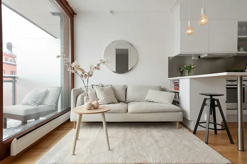
The Japandi approach to color uses the greige and warm white palette as its foundation - warm enough to feel inhabited, neutral enough to recede visually and let natural materials take centre stage.
Room-by-Room Color Guide
Bedroom: Prioritise Cortisol Reduction
The bedroom is where color psychology matters most - and where most people get it most wrong. Stark white walls in a bedroom are not neutral. They are stimulating. The brain reads high contrast and clinical brightness as "alert environment," which is the opposite of what sleep requires.
The night I repainted my bedroom soft sage, I slept eight hours without waking once. I had been averaging five for months and had tried everything else first - earlier bedtimes, no screens, supplements. It was the walls.
Goal: lower arousal, signal safety to nervous system.
Best choices: soft sage green (biophilic, restorative), warm greige (low cognitive load, universally calming), dusty blue #8A9EAF (slows heart rate, promotes sleep). If you are looking for a more sophisticated take on these calming tones, integrating elements of French Blue Design can add a layer of historical elegance to the bedroom without losing that essential sense of tranquility.

Avoid: red, bright orange, bright yellow (raise cortisol), stark white (too clinical), high contrast combinations (visually stimulating).
Living Room: Balance Energy and Calm
The living room needs to do two contradictory things: hold energy when you have people in it, and release it when you need to decompress alone. Cool grey fails at both it is neither warm enough for social comfort nor calming enough for genuine rest. It just sits there, flat and draining.
After I switched to warm greige in my living room, friends started staying later. Not dramatically an extra hour, here and there. But the room had become easier to be in. Nobody wanted to leave. I noticed it before I understood why.
Goal: social comfort and ability to decompress.
Best choices: warm greige as base with terracotta accent, sage green (grounding without being sedating), warm white with natural material accents.
Avoid: cool grey (emotionally flat, drains warmth from social spaces), overly dark all-over (oppressive in the room you use most).

Kitchen: Functional Energy Without Overstimulation
My kitchen was grey for a year. I cooked in it maybe twice a week and ordered in the rest of the time, vaguely telling myself I was just not a cooking person. After switching to warm white with soft sage cabinet fronts, I started cooking almost every day. The room had stopped feeling like a chore and started feeling like somewhere I actually wanted to be.
Goal: mild energy boost, appetite stimulation, practical clarity.
Best choices: warm white (clean, functional, food-friendly), soft sage (increasingly popular for 2026 kitchen cabinetry), ochre accent #C8A85A (appetite-stimulating, warm).
Avoid: blue (suppresses appetite used in weight-loss environments deliberately), dark dominant colors (reduces perceived cleanliness).

Home Office: Focused Without Fatigue
Goal: sustained attention, low visual fatigue.
Best choices: warm white (low distraction), very pale sage (slightly stimulating without anxiety), greige (reduces visual noise during long work sessions).
Avoid: red (raises cortisol, increases anxiety over time), overly dark colors (increases fatigue in sustained use). Lighting and Color: The Interaction Most People Ignore
Here is something nobody tells you when you are choosing paint colors: the color on your wall is not the color you see. It is the color filtered through your light source.
I learned this the expensive way two tins of paint, two trips up a ladder, one color that looked completely different on the wall than it had in the shop. The difference was not the paint. It was that the shop had warm lighting and my flat had cool daylight bulbs.
Rule: change your bulbs before you test any paint color.
Room Orientation Guide
Room Orientation | Light Quality | Effect on Color | Recommendation |
North-facing | Cool, flat, indirect | Makes cool tones grey and cold | Add 2–3% more warmth to chosen color |
South-facing | Warm, direct, changes through day | Makes warm tones glow, can wash out | Test at midday and evening separately |
East-facing | Warm morning, cool afternoon | Morning: warm glow / Afternoon: flat | Best for bedrooms; avoid cool colous |
West-facing | Cool morning, warm evening | Evening: golden warmth / Morning: grey | Ideal for living rooms used in evening |
Bulb Temperature Guide
Bulb Temperature | Light Quality | Effect on Warm Colous | Effect on Cool Colous |
2700K | Warm amber | Enhances, makes glow | Turns grey or brown |
3000K | Warm white | Enhances slightly | Appears slightly grey |
4000K | Neutral white | Flattens warm tones | Shows true color |
5000K+ | Cool daylight | Makes warm tones muddy | Shows true color |
For Japandi and Warm Minimalist interiors: always 2700K. Any other temperature fights the warm palette. When you switch to 2700K in the evening, your home stops feeling like a place you work and starts feeling like a place you rest. It is a single bulb change that most people never make and one of the highest-impact things in this entire guide.
For a complete guide to how layered lighting transforms room color and atmosphere: Home Lighting Ideas 2026
Green Color Psychology: Special Focus
Green is the most psychologically powerful interior color and the most versatile in 2026. The reason is evolutionary: the human nervous system reads green as vegetation, and vegetation means safe terrain, available food, no immediate threat. It is a signal hardwired for hundreds of thousands of years, and a dusty sage wall activates it whether you are aware of it or not.
Green measurably reduces cortisol within 20 minutes of exposure in enclosed spaces. The brain processes green with less effort than any other color family.
Green Spectrum Guide
Green Type | HEX Range | Mood | Best Use |
Sage (dusty) | #8FAF8A–#B2C4AD | Calm, grounding | Bedroom, living room walls |
Olive | #8A8A5A–#9A9A6A | Earthy, sophisticated | Feature wall, kitchen cabinets |
Forest (dark) | #3A5A3A–#4A6A4A | Cocooning, dramatic | Feature wall only |
Mint (cool) | #A8D4C8–#B8E0D4 | Fresh, light | Bathroom, small accent |
Celadon | #ACB89A–#B8C4A8 | Elegant, restrained | Living room, bedroom |
2026 recommendation: dusty sage and celadon are the two green shades with the highest use in Quiet Luxury and Japandi interiors this year.

Warm Minimalism and Color Psychology
Warm Minimalism is, at its core, a color psychology strategy not just an aesthetic. The principle is simple: reduce the number of competing color signals so the nervous system can process the room without effort. Then add warmth through texture and natural materials rather than additional colors. The result is a room that feels calm before you do anything in it.
The Warm Minimalist color rule: 60% warm neutral base (greige, warm white, pale putty), 30% natural material tones (wood, linen, stone these read as color), 10% one intentional accent (sage, terracotta, dusty rose).
This approach achieves low cognitive load so the room feels calm before you do anything in it, warmth that signals safety and lowers baseline cortisol, and a biophilic grounding effect from natural material tones.
Because natural material tones do 30% of the work in this palette, the furniture you choose matters as much as the paint - solid wood, linen, and warm-toned pieces carry the color story. My guide to the best furniture stores in the US ranks where to find them by quality and price.
How to Test a Paint Color Before Committing
I spent three months going back and forth between two nearly identical greiges. Paint chips, phone photos, screenshots from Pinterest none of it helped. Then I found the linen test and settled the question in ten seconds.
Step 1 - Buy a tester pot. Never choose from a small chip against a white background.
Step 2 - Paint a 50 x 50 cm patch directly on the wall - not on card.
Step 3 - Observe at three times: morning light, afternoon light, and artificial evening light.
Step 4 - Hold your existing textiles against it - linen, wood, any rug. If they look warmer and more alive, proceed.
Step 5 - Live with it for 48 hours before deciding. The first impression is not the settled impression.
The warm undertone test: if you are uncertain between two neutrals, hold a piece of undyed linen against each. The one that makes the linen look warmer and more golden is the right choice for a Japandi or Warm Minimalist interior. Ten seconds with a piece of linen settled what weeks of paint chips could not. It works in the other direction too: once the walls are settled, choosing a rug color comes down to the same undertone match, and my rug guide maps the exact pairings for greige, white, sage, and dark rooms.
FAQ
What is the psychology of interior design?
The psychology of interior design studies how spatial elements color, light, texture, proportion affect the nervous system, mood, and cognitive state. Color is the most immediate variable: certain hues lower cortisol within minutes, while others raise it. The practical application is designing spaces that actively restore rather than drain the people who inhabit them.
What is the best paint color for living room walls in 2026?
Warm greige is the most versatile and psychologically effective living room color in 2026. It reduces visual noise and cognitive load, pairs with any natural material palette, and works in both north and south-facing rooms with warm bulbs. Reference shades: Farrow & Ball Elephant's Breath, Benjamin Moore Pale Oak, Dulux Perfectly Taupe.
What are the trending wall color for 2026?
The dominant 2026 palette centres on warm greige, pale putty, dusty sage, muted terracotta, and warm white with yellow undertones. Cool grey has largely been replaced by warm greige in Quiet Luxury and Japandi interiors. Bright color are absent the trend is entirely toward muted, desaturated, natural tones.
Does green color psychology support its use in bedrooms?
Yes, strongly. Green measurably reduces cortisol and heart rate. The best bedroom greens in 2026 are dusty sage and celadon both desaturated enough to feel restful rather than stimulating. Avoid bright or cool-toned greens such as mint or lime in bedrooms as these can be visually activating.
How does lighting affect paint color?
Significantly. A warm greige at 2700K looks rich and inviting; the same color at 5000K looks flat or muddy. North-facing rooms need 2–3% more warmth added to any chosen color to compensate for the cool, indirect light. Always test paint colors in the actual room, at the actual time of day you use it most, with your actual light bulbs installed.
Quick Reference: color Psychology Cheat Sheet
By Psychological Goal
Goal | Best color | Avoid |
Lower cortisol | Sage green, soft blue, warm greige | Red, bright orange, stark white |
Improve sleep | Dusty blue, soft sage, warm greige | Red, bright yellow, high contrast |
Increase focus | Warm white, pale sage | Red, dark all-over |
Feel grounded | Terracotta, warm brown, ochre | Cool grey, stark white |
Make room feel larger | Warm white, greige, pale putty | Dark all-over, cool grey |
Create warmth | Greige, terracotta, warm sage | Cool white, cool grey, stark neutrals |
By Room
Room | First Choice | Second Choice | Avoid |
Bedroom | Soft sage #8FAF8A | Warm greige #C4B5A5 | Red, bright yellow |
Living room | Warm greige #C4B5A5 | Dusty terracotta #C4896A | Cool grey |
Kitchen | Warm white #F0EBE0 | Soft sage cabinets | Blue |
Bathroom | Dusty blue #8A9EAF | Warm white | Stark white |
Home office | Warm white #F0EBE0 | Very pale sage | Red, dark all-over |
Hallway | Warm greige | Pale putty #D4C8B8 | Dark, heavy colors |
Key Numbers
2700K - only bulb temperature for warm neutral interiors. 60-30-10 - base neutral / natural materials / accent color ratio. 48 hours minimum time to live with a tester before deciding. 50 x 50 cm minimum patch size for accurate color testing.
Love our ideas? Let's bring them into your home. WarmCazza now designs rooms like this, remotely - your own concept, layout and shopping list. Explore E-Design → About Nina Sajaia
Nina Sajaia is the founder of WarmCazza and has been writing about interiors, slow living, and the psychology of home since 2021. Her work on Japandi and Warm Minimalism has been shared across interior design communities in Europe and the US. She lives in a 58m² flat she has redesigned four times each version a different experiment in color, light, and what it feels like to come home.
This article was written by WarmCazza and is informed by current US furniture market research, assembly testing, and 2026 interior design trend analysis. © WarmCazza - All Rights Reserved.

Comments